Is Your Website Accessible?
What is Web Accessibility?
Accessibility in web development is an important topic that often falls to the side during a busy development cycle. Ensuring the sites you develop and support are accessible to a wide range of ability levels and user types is as important as getting that pixel-perfect finish on your landing page. Unfortunately, because many of the people that build websites do not depend on assistive technologies, this requirement is often forgotten or left out of requirements altogether.
The goal of web accessibility is to ensure that all possible users can use your site comfortably, no matter how they access the content. While many users may use a mouse to navigate your UI, some users may only be able to use a keyboard. Similarly, many users may be able to read small fonts comfortably on a large screen and other users may require an enlarged font size in order to read the content. Additionally, other users may rely on screen readers in order to read the page content at all. A full review of accessibility standards is outside the scope of this article as we barely scratch the surface of accessibility; we encourage you to head over to the excellent https://webaim.org for some detailed information on web accessibility. See our Resources section below for more information.
Why Go Accessible?

Not only is accessible web design the right choice ethically (who wants to create content that excludes a portion of your user base?), it is also the most business-savvy choice. Currently, the federal Americans with Disabilities Act requires websites to be compliant with Section 508 requirements. In June 2018, the language of the Web Content Accessibility Guidelines 2.1 (WCAG) was updated to improve accessibility for users with cognitive or learning disabilities, users with low vision, and users with disabilities on mobile devices. This means that WCAG is now the law of the land. In addition, accessibility is common sense – how are you supposed to support and retain users if they simply cannot use your site?
Qualities of an Accessible Site
The gold standard for web accessibility is WCAG 2.1. There are three levels to be aware of:
- Level A – considered the most basic level of accessibility. Level A improves usability, but it does not mean that a site is accessible to all users.
- Level AA – the best goal for sites trying to be accessible to all users. Level AA also aligns with Section 508, so if you are trying to be legally compliant this is the most important level.
- Level AAA – this is the “reach” goal. It is not required by Section 508 because not all Level AAA guidelines can be met for all sites or types of content.
Note: If the Level is omitted from accessibility literature, it is typically referring to Level AA.
WCAG defines a number of Guidelines that are organized into four top-level Principles. These form the core of the WCAG standard.
Perceivable

Perceivable means that the content of your page can be perceived by all users. Because people perceive things in different ways, this principle deals a lot with providing alternative means to perceive content. For example, content on the site that is visual such as images or video are required to have text alternatives so screen reader software can determine what is happening in the visual. Sound clips must have accompanying text to explain the content of the media, and animations should also have accompanying audio if they provide meaning to the user interaction.
This principle also includes the site design; there are defined minimum color contrast ratios and requirements about the ability to resize text. Additionally, you will want to consider the structure of the content to make sure that it follows a logical flow and doesn’t require jumping to different parts of the page to access required information.
Operable

To have an Operable site you must have a site that does not rely on any one input method (e.g. a mouse or touchpad). For example, if you use a navigation scheme that relies on mouse hover in order to show or hide certain elements, the navigation items in sub-menus will likely not be accessible by keyboard. They also may not be accessible by tablet or touch devices. This is a serious impediment to accessibility!
Another element of operability is in regards to timeouts or media that plays over time. In general, you always want to give your users control over when, if, or how long something happens on your site. If sessions timeout without warning, videos play automatically, or background sound cannot be stopped – you will want to reconsider your design.
Lastly, in order to be Operable your site must do more than just meet the minimum requirements – it must also reach a degree of user-friendliness. WCAG defines this with several guidelines related to repeated content, navigation blocks, focus visibility and more. For more detailed information, please see the quick reference.
Understandable

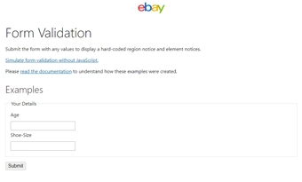
An Understandable site is one that is explicit and consistent about how it is used. This includes things that are relatively simple (e.g. declaring a page’s language in the html element), to somewhat complex (e.g. robust error handling for form entry). When we onboard new Developers, we often point them towards eBay’s excellent MIND Patterns site for examples of how to achieve some of these guidelines.
Another element of Understandable sites is their consistency when dealing with user input. Understandable sites never trigger changes to a user’s context without warning, and never start or stop behaviors without the user’s explicit control or consent.
Robust

Robust websites are sites that are machine-friendly. Unlike most of the other Principles which are focused on user interaction, the Robust Principle is only focused on two things:
- Valid code
- Semantic code
Valid code is that thing we all learned about in Web Development 101, where you pass your HTML and JavaScript into a validator and wait for the green checkmark. As simple as it is, this is an important element of accessibility because it provides a reliable API for future assistive technologies to rely on.
Semantic code is a term that can sometimes refer to different things, but in this context it simply means that all UI elements have machine-readable attributes and names. Specifically, the Name, Role, and Value of any interactive page elements (e.g. forms) must be readable, as well as other landmarks such as headers and navigation blocks.
Accessibility Best Practices
As you may have already figured out, web accessibility is a wide and complex topic. However, there are some best practices that you can follow to make it more digestible. Our Resources section has lots of material for you, but here are some general principles to keep in mind when developing for accessibility:
- Start with an accessible design.
- Use valid, semantic markup whenever possible.
- Think in advance about how users will access content by keyboard.
- Be explicit about everything in the markup. For example, if an element is meaningful, label it well. If it is just eye candy, explicitly remove it from accessibility tools it with aria-hidden.
- Give the user control over everything. Everything in your site should be able to be initiated, paused, adjusted, or stopped by the user.
These are some practices that we live by, but this is definitely not the end of the road. We rely on a variety of accessibility checklists as well to make sure we’ve dotted our “i”s and crossed our “t”s, and we’ve included a few of our favorites in the Resources section below.
Testing for Accessibility

While there are lots of automated solutions for testing accessibility, there is no “silver bullet” to ensure your site is Accessible. Testing accessibility is a process that requires user interaction with the site, critical thinking about how users will interact with your site, and iterating on the design/develop/test cycle to ensure the site meets established standards.
To get you started, Karl Groves has written an excellent starter list of the 6 simplest accessibility tests anyone can do. You can also refer to the WCAG checklist produced by WebAIM, which provides an excellent starting point to ensure your site is compliant with modern standards. Be prepared to dive deep into the official specification or quick reference to ensure you are checking all the boxes. In addition, do yourself a favor and download a screenreader to understand what it is like for visually impaired users to access your site. NVDA is the leading free option on the market, and JAWS (a leading paid option) allows free access for 40 minutes per day.
Wrapping it Up
Web accessibility is a large topic and it is often daunting due to the reliance on technical jargon and “legalese” surrounding discussions of compliance. Despite all this, accessibility is really just an extension of everyday principles of web design: intuitive UI, delightful UX, and cross-platform usability. While you probably already consider these everyday practices for your development, expanding your definitions to include accessible design can fundamentally shift the way users interact with your site, and ultimately make your product better for everyone.
Resources